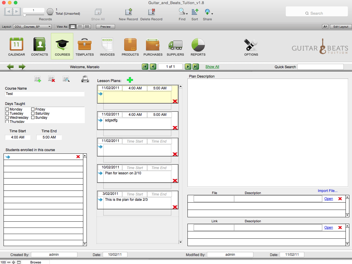
It has been a long day and I am pulling my hair out trying to work out how to display the plan description when a lesson plan date/time is selected. I realise there is not a lot of real estate space for many portals and working with three columns whilst giving as much space to the third is where the creative wheels are falling off. I think the initial idea is good, it’s the layout that is terrible.